Web Statistics February 2013

Thursday, 28 February 2013

Dow Jones Industrials Within Reach of All-Time High

Dow Jones Industrials Within Reach of All-Time High

As you can see the chart below, the Dow Jones Industrials Within Reach of All-Time High

Even though the dow jones is within all time highs, we can see the bulls have been winning for many months now. Even if we were to get a very large dip, or sell off, the bulls seem to shake it off, and new all time highs could be just around the corner.

If you go back to our past posts, sentiment trader kept reminding our readers not to fall in love with the downside, and now here we are at all time highs! :-)


Dow Jones Industrials Within Reach of All-Time High


WHAT IF YOU KNEW WHICH WAY THE MARKET WAS ABOUT TO MOVE BEFORE IT HAPPENED?  CLICK HERE To Join Our VIP ELITE GROUP  -- FREE 10 Day Trial Offer Today! 

Wednesday, 27 February 2013

Dow jones repeating pattern - Dow jones repeating pattern

Dow jones repeating pattern

Is there a Dow jones repeating pattern on the chart.

When I took a look at the Dow jones transports chart, I thought to myself, we could be looking at a repeating pattern or a replicating pattern.

Repeating patterns on the market are very frequent and we do teach our VIP members this from time to time. Anyway, the dow jones transports chart took my fancy today, and thought I would post it for all eyes to see.

Dow Jones Transports chart

WHAT IF YOU KNEW WHICH WAY THE MARKET WAS ABOUT TO MOVE BEFORE IT HAPPENED?  CLICK HERE To Join Our VIP ELITE GROUP  -- FREE 10 Day Trial Offer Today! 

annoying range - The Annoying Range

The Annoying Range 

There seems to be an annoying range right now on the market. This is what is called a megaphone pattern in terms of technical analysis.

Megaphones can last a few days, or a few weeks, and normally gather momentum for a break out or break down below their extremities.

We are at 2741 on the nadaq which is the leader of the market. And need to watch things carefully to see where the leader wants to take us next.

As you can see since new years day, the market has been strong and now halted in this annoying range.


megaphone pattern
annoying range


WHAT IF YOU KNEW WHICH WAY THE MARKET WAS ABOUT TO MOVE BEFORE IT HAPPENED?  CLICK HERE To Join Our VIP ELITE GROUP  -- FREE 10 Day Trial Offer Today! 

Tuesday, 26 February 2013

latest spx update - our latest spx update

There has been lots going on as of late, and the market did indeed need to take a break.

As you can see we topped out several days ago, and we are currently trading below the 1500 mark at or around the 1494 level.

we do have lower targets, however..........  levels, for VIP ELITE GROUP  only! - Join Here! 


spx update


The market breadth chart was in overbought territory as we have been saying a drop was due, and we are getting a nice one after reaching sentiment traders VIP levels. We are at the 65 level, and there is more room to run down, but we still remain in a bullish market. 

market breadth update


WHAT IF YOU KNEW WHICH WAY THE MARKET WAS ABOUT TO MOVE BEFORE IT HAPPENED?  CLICK HERE To Join Our VIP ELITE GROUP  -- FREE 10 Day Trial Offer Today! 

Tuesday, 19 February 2013

bull market - bull market indicator

bull market - bull market indicator

Again I hear so many people say the bull market is gone, and we are in a bear market.

They are also saying we are not in a bull market right now. Is this true, or a lie?

Well in all my years as an analyst, I do not read newspapers or listen to the so called gurus, I always come back to the charts, not matter if we are in a bull market or a bear market. Always remember the charts never lie, I mean NEVER!

The bull market / bear market indicator is saying that right now we are in a bull market. Now this does not mean we cannot go down or sell off violently at some stage, but this indicator is very good for seeing the longer term picture and very reliable. Buying the dips has been working very well for a few years now.

Since 2009 the bears have struggled badly, they have had their chances to go short along the way, however just as they got excited, the market turned on them yet again and we started travelling up again.

As you can see on the chart below, the current bullish market started in January 2012 and we are now a few hundred points higher on the SPX.

The bears out there have obviously not looked at charts like this, and keep trying to go short or call a crash. As said, even if we sell off hard, the direction of this market is up, and we have a good plan to make money no matter what happens anyway.


bull market indicator


WHAT IF YOU KNEW WHICH WAY THE MARKET WAS ABOUT TO MOVE BEFORE IT HAPPENED?  CLICK HERE To Join Our VIP ELITE GROUP  -- FREE 10 Day Trial Offer Today! 

spx update - the latest spx update

spx update

Our VIP MEMBERS are out of the market, with some nice gains, 90pts infact. Very nice indeedy.

The markets in the next several months are in for a nice WILD RIDE I think. This happens every time we get conditions like we are seeing, so its gunna be very lucrative to those who know what they are doing, I am sure.

This is no doubt the S&P chart right now is looking very healthy. See how we bottomed with the INVERTED HEAD AND SHOULDER and now we are travelling up in a nice upwards channel, that has not been violated for now.

There are many bears out there, since 1450 screaming for a crash, however our VIP MEMBERS were able to do very well on the upside while all this screaming went on, and I have a felling there is more movements on both sides of the market to profit from.

For now, the market more bullish, but a key note here is it is very overbought, and traders who are late to the rally party do not know what to do.

spx daily chart
spx daily chart


WHAT IF YOU KNEW WHICH WAY THE MARKET WAS ABOUT TO MOVE BEFORE IT HAPPENED?  CLICK HERE To Join Our VIP ELITE GROUP  -- FREE 10 Day Trial Offer Today! 

Sunday, 17 February 2013

dot com crash recovery - the dot com crash recovery

dot com crash recovery

Below is a chart for your viewing pleasure. As you can see, on the NASDAQ monthly chart Since 2009 we have recovered and seen new highs.

We have even done a 50% retracement of the dotcom crash phenomenon back in the the early 2000's


WHAT IF YOU KNEW WHICH WAY THE MARKET WAS ABOUT TO MOVE BEFORE IT HAPPENED?  CLICK HERE To Join Our VIP ELITE GROUP  -- FREE 10 Day Trial Offer Today! 


Saturday, 16 February 2013

Gold Chart - The Gold Chart update

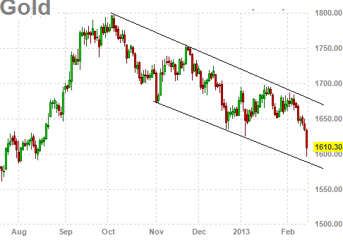
We have been keeping an eye on the gold chart as of late. As you can see we have been in a massive downwards channel that has been holding very well.

The gold chart has a bottom projection target of the  high 1500's and we nearly hit that on friday after a rather significant sell off. This week gold sold off significantly, but there could be more downwards coming.

There are no buy signals yet, and we are of the opinion that gold is soon going to be a very good BUY soon.  One must be careful NOT just to buy right now, as there is still room to move on the downside, and the signals that sentiment trader is getting is just to be patient here, because most good traders know that on the market patience can BANK you alot of coin.

gold chart
gold chart - the latest gold chart


WHAT IF YOU KNEW WHICH WAY THE MARKET WAS ABOUT TO MOVE BEFORE IT HAPPENED?  CLICK HERE To Join Our VIP ELITE GROUP  -- FREE 10 Day Trial Offer Today! 

Market Breadth - Market breadth charts

The Advance-decline chart or the stocks above or below their Moving averages is telling us the market is getting super excited.

Yes it will need to cool down soon, but we expect things to ..... (VIP MEMBERS ONLY)

market breadth
market breadth chart


WHAT IF YOU KNEW WHICH WAY THE MARKET WAS ABOUT TO MOVE BEFORE IT HAPPENED?  CLICK HERE To Join Our VIP ELITE GROUP  -- FREE 10 Day Trial Offer Today! 


Friday, 15 February 2013

USD weekly chart - The usd weekly chart is telling

usd weekly chart

The usd weekly chart is very telling. I have been watching it like a hawk. As the inverse trade against the market, the usd weekly chart looks to be on a buy signal.

The usd weekly chart  stochastics has turned up and also MACD so this shifting does seems significant.


usd weekly chart
usd weekly chart

WHAT IF YOU KNEW WHICH WAY THE MARKET WAS ABOUT TO MOVE BEFORE IT HAPPENED?  CLICK HERE To Join Our VIP ELITE GROUP  -- FREE 10 Day Trial Offer Today! 

Thursday, 14 February 2013

McClellan Timer chart - McClellan Timer chart

McClellan Timer chart below.

As you can see the McClellan timer chart is a good chart to spot divergences. The chart below is showing us that the Nasdaq has been in a nice upwards channel since the very beginning of 2013. We have not busted out of this channel on the up side or the down side.

The most important thing on this chart is that the NAMO market breadth has been declining for the last few months, while the price has been increasing slowly and steadily.

The NAMO is still in positive territory and that is a good thing for the bulls, and due to the face we are still in that upwards channel drawn below, that is also favoring the bulls.

The worrying thing here is that rising price, and falling NAMO is not bullish typically.

This chart is now telling us that the 3150 or around this level is very significant.

McClellan Timer chart
McClellan Timer chart 


WHAT IF YOU KNEW WHICH WAY THE MARKET WAS ABOUT TO MOVE BEFORE IT HAPPENED?  CLICK HERE To Join Our VIP ELITE GROUP  -- FREE 10 Day Trial Offer Today! 

Wednesday, 13 February 2013

The Plateau

The Plateau


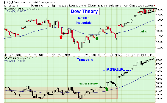
If we have a look at the leader of the market, we seemed to have just plateaued out and going no where.

We need to wait a bit while we wait for the market to chose a direction. So far the bulls have had a fantastic run, but they do not seem to be out of breath just yet.

Yesterday we posted this chart for our VIP MEMBERS only with summation charts. I have posted this here, and traders are on the sideline waiting for the market to move north or south, its annoying when the market hardly moves, and in a tight range which is what is happening at the moment.

dow jones transports


WHAT IF YOU KNEW WHICH WAY THE MARKET WAS ABOUT TO MOVE BEFORE IT HAPPENED?  CLICK HERE To Join Our VIP ELITE GROUP  -- FREE 10 Day Trial Offer Today! 

Tuesday, 12 February 2013

slowly slowly catch a monkey

slowly slowly catch a monkey

The s&P chart below is telling us a lot right now. While I keep seeing people scream down the markets are not saying that yet.

We are overdone on the upside and met our 1500 targets, however the market does what it does best, listens to no one or nothing. Right now the market is still in a skinny upwards channel. So far that channel has been holding, and for now that is NOT BEARISH.

spx chart
spx daily chart


WHAT IF YOU KNEW WHICH WAY THE MARKET WAS ABOUT TO MOVE BEFORE IT HAPPENED?  CLICK HERE To Join Our VIP ELITE GROUP  -- FREE 10 Day Trial Offer Today! 

Saturday, 9 February 2013

vix weekly chart - vix weekly chart

vix weekly chart - vix weekly chart update

The  vix weekly chart  is very interesting right now. This is the inverse to the market. I have been seeing very large Call orders come through for the vix the last few days, which I think is very very interesting.

The vix weekly chart now has 3 black candles in a row. I went back on the chart and I could not see this formation for a year or so. So we are obviously seeing a fundamental shift take place in the market. The VIX and the vix weekly chart  is a good representation of this.

The vix weekly chart needs to break the 15 level, or down below the 12.5 level before we see a bigger shift and market movements take place.


vix weekly chart
vix weekly chart


WHAT IF YOU KNEW WHICH WAY THE MARKET WAS ABOUT TO MOVE BEFORE IT HAPPENED?  CLICK HERE To Join Our VIP ELITE GROUP  -- FREE 10 Day Trial Offer Today! 

Broke To The Upside

Well we were saying the range on the S&P should be watched carefully, and said it was not long till we broke either upside or downside.

You can see in our LAST POST HERE

We broke to the upside, however I would not call it a convincing break!. The bulls yet again still have the upper hand I think. We are still up past our 1500 level we called months ago, and still the bears do not seem to be making their mark.


Yes, we are still in a bull market, however I can say to you that we are starting to see some very interesting signals on the charts, and a few warning signs that market may soon get a bit tired.


WHAT IF YOU KNEW WHICH WAY THE MARKET WAS ABOUT TO MOVE BEFORE IT HAPPENED?  CLICK HERE To Join Our VIP ELITE GROUP  -- FREE 10 Day Trial Offer Today! 

Thursday, 7 February 2013

Range - spx range

Range - spx range

Check out the hourly chart on the SPX, for the last few days we have been trading in nothing more than a range. UP and DOWN like a yo-yo!!!! :D

Once this breaks either way, its off to the races I feel. Tis just a matter of time.


WHAT IF YOU KNEW WHICH WAY THE MARKET WAS ABOUT TO MOVE BEFORE IT HAPPENED?  CLICK HERE To Join Our VIP ELITE GROUP  -- FREE 10 Day Trial Offer Today! 

Wednesday, 6 February 2013

mid week update - spx mid week update

Alot of jumping around on the S&P and global markets today.

There are lots of people out there saying the market is about to crash, the sentiment still remains the same.

At the moment whenever the S&P has sold off seems that the smart money is just holding their nose and buying more.

Yesterday there was a little confusion, however that seems to have sorted itself out today, as things went along in an orderly fashion.

if you have a look at the S&P chart, and the RUSSELL, they seem to be holding quite well, for now anyway. 

spx chart
spx chart

russell 2000 chart
russell 2000 chart


We do have a busy day on the market tomorrow, and there will be lots of movement. Tomorrow we have Chain Store Sales, Charles Evens Speaks, Jobless Claims, Productivity & Cost, Nat Gas, Consumer Credit, Fed Balance Sheet and Money Supply.


WHAT IF YOU KNEW WHICH WAY THE MARKET WAS ABOUT TO MOVE BEFORE IT HAPPENED?  CLICK HERE To Join Our VIP ELITE GROUP  -- FREE 10 Day Trial Offer Today! 

Tuesday, 5 February 2013

usd chart index - usd chart index

usd chart index

The usd chart index is quite interesting, and we have been watching this for the last few days.

the usd chart index has been trading back in a downwards channel, and still keeping the global stockmarkets boyant, no matter the pessimism around, this chart is very telling.

usd chart index
usd chart index


WHAT IF YOU KNEW WHICH WAY THE MARKET WAS ABOUT TO MOVE BEFORE IT HAPPENED?  CLICK HERE To Join Our VIP ELITE GROUP  -- FREE 10 Day Trial Offer Today! 
nasdaq chart - the nasdaq chart is telling

The market still seems to be holding, and taking lead from some of the market breadth indicators.

If you have a look at the nasdaq chart you can see that it has been holding its range for the last few weeks now.

This was looking like a bullish flag, however now this has just turned into a elongated range, and we must wait to see what happens.

nasdaq chart
nasdaq chart


WHAT IF YOU KNEW WHICH WAY THE MARKET WAS ABOUT TO MOVE BEFORE IT HAPPENED?  CLICK HERE To Join Our VIP ELITE GROUP  -- FREE 10 Day Trial Offer Today! 
Sunday, 3 February 2013

spx weekend update - spx weekend update and mulling

spx weekend update - spx weekend update and mulling

Over the weekend, I was looking at many charts. AI sentiment still showing us that we are in overbought territory with the S&P 500, however it does not look extreme.

As you can see we are in the sell zone, however on the line chart there is still room for us to wiggle up a bit higher. It looks like for months now the market has been creating a bearish rising wedge, and we must remember sentiment can shift however the first warning shot has not gone off yet, and it is possible we can see higher prices next week. Just a guess.

Our 1500 target has been hit :-) and the market on Friday shot up and is holding for now. The bulls still seem like they are not running out of steam just yet, so we must listen to that for now and forget the crowing roosters out there.


AI Sentiment
AI Sentiment


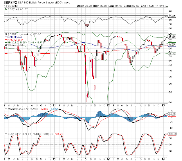
Taking a look at the S&P bullish percent, again we are still on a buy situation. We are up at 82.60 but there is no reason we cannot go up a bit more to ***** **VIP MEMBERS ONLY**

As you can see January has been a very good month, and very rewarding to the VIP MEMBERS


spx index
spx index


It seems the last few weeks, every man and his dog, and the so called expert pundits have been calling for a top on the market. Then the next week, more bears come out of the woodwork and call for a top again. It has not come yet! Are you starting to see a pattern here. LOL. Although this is not strange behavior, it has been quite entertaining.

Forget the pundits out there. All we need to do is read the charts for now and follow them. That has been working like gangbusters, and they will give us plenty of warning on what to expect and what actions to take next. :-)

Have a great weekend :-)

WHAT IF YOU KNEW WHICH WAY THE MARKET WAS ABOUT TO MOVE BEFORE IT HAPPENED?  CLICK HERE To Join Our VIP ELITE GROUP  -- FREE 10 Day Trial Offer Today! 

Friday, 1 February 2013

Nasdaq Weekly Chart - The Nasdaq weekly chart

Nasdaq Weekly Chart

If we have a look at the Nasdaq Weekly Chart we can see just how amazing it is.

Now for those out there that do not know the different between bullish or bearish.

Bullish = When you see a chart go from bottom left to the top right that is bullish. 

Bearish = When you see a chart go from top left to bottom right that is bearish. 

The Nasdaq Weekly Chart is still showing us the bulls are in control.

Since 2009 we have not broken the fantastic rising support line seen below.


nasdaq weekly chart
nasdaq weekly chart


No matter what the pundits out there are saying, this chart is bullish. Now I am not saying we will not see some dips, and maybe even some gigantic dips, but do not be surprised if we finish alot higher by the end of 2013. :-)


WHAT IF YOU KNEW WHICH WAY THE MARKET WAS ABOUT TO MOVE BEFORE IT HAPPENED?  CLICK HERE To Join Our VIP ELITE GROUP  -- FREE 10 Day Trial Offer Today! 

Market Wrap Update - Latest Market Wrap

Market Wrap Update - Latest Market Wrap

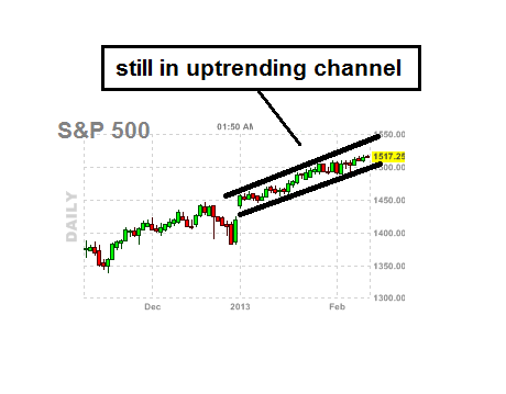
Well the non-farm payroll pleased investors today and we went up again. Check out the S&P chart, we are still inside a nice upwards channel. That is telling us things are bullish for now.

upwards channel
upwards channel


One of my free readers here, even had the hide to comment and email me personally and tell me a got it wrong, after we went down one day!, then up we went again today! The nerve of some people.

Go back on the blog, I do not claim to be god or superman, but do the best to provide what I believe to be good valuable advice here.


WHAT IF YOU KNEW WHICH WAY THE MARKET WAS ABOUT TO MOVE BEFORE IT HAPPENED?  CLICK HERE To Join Our VIP ELITE GROUP  -- FREE 10 Day Trial Offer Today!