Web Statistics March 2014

Friday 28 March 2014

stock market crash every 7 years

stock market crash every 7 years

stock market crash every 7 years

Does the stock market crash every 7 years ?

Well nothing is set in stone, but be that as it may there is what I can see a 7 year cycle occuring on the market right now. See the chart below. => I GO MORE IN DEPTH IN OUR VIP ELITE GROUP HERE!!!!!

stock market crash every 7 years

As you can see,  if you look at the chart above you can see that the stock market has come into some trouble every 7-8 years over the last 20 years. So this is an interesting statistical if you look at this sort of thing, or you are an active trader right now.

I guess, in my own opinion no one really does have a crystal ball, to tell what happens on the market today, tomorrow next week or next year. But what we do have is history on our side and as a student of history its very interesting, that historical patterns tend to repeat themselves over and over again, and it is the cornerstone to technical analysis.

If stock market crash every 7 years, will this happen soon? Well your guess is as good as mine there, but it is something to look at when the time is right. With all the tapering going on right now and also Janet Yellen starting to sneak the words interest rates, and increase in interest rates coming, then things could get interesting. But until then, we keep our nose to the grindstone.


WHAT IF YOU KNEW WHICH WAY THE MARKET WAS ABOUT TO MOVE BEFORE IT HAPPENED?  CLICK HERE To Join Our VIP ELITE GROUP  -- FREE!


Powered by 123ContactForm | Report abuse

Thursday 27 March 2014

spx update chart

spx update chart

The S&P has been in nothing more than a range these last few weeks. Eventually it will have to break up or down.

MACD is putting pressure on the market so far which is still on a sell, however the bears just do not have alot of power to take the market down here.

When you see a chart like the one below, it is a reminder that we are in a BULL MARKET, meaning you see higher lows, and higher highs. For now the bull market remains in check.


spx update chart
spx update chart


WHAT IF YOU KNEW WHICH WAY THE MARKET WAS ABOUT TO MOVE BEFORE IT HAPPENED?  CLICK HERE To Join Our VIP ELITE GROUP  -- FREE!


Powered by 123ContactForm | Report abuse

Monday 24 March 2014

biotech update

biotech update

biotech update
biotech update below. As you can see a few months ago I posted to tell you just how good the biotech sectors have been performing. Today, as you can see things are really getting hammered.

I am more of the opinion that large funds and institutes are just doing some sector rotation and annual selling, but we will see.

BIOTECH closed at 147 today, and  if feels like there is more downside coming soon, MACD also remains on a sell.


biotech update
biotech update


WHAT IF YOU KNEW WHICH WAY THE MARKET WAS ABOUT TO MOVE BEFORE IT HAPPENED?  CLICK HERE To Join Our VIP ELITE GROUP  -- FREE!


Powered by 123ContactForm | Report abuse

Saturday 22 March 2014

spx update

spx update

The S&P has been trading in a 60 point range at the moment. Eventaully this will have to break either upwards or downwards and flow that market that way. But for now, this annoying grind sideways lasts.

You would expect this too, as back in FEBRUARY we saw one of the biggest rallies we have seen in the last 12 or so months. At a time when everyone was saying the market will crash. This is a lesson to the bears for 2014, do not write off the bulls yet, there is not reason too.

Its funny, you know, because every time the bears seem to write off the bulls, they come right back and give them a swift kick to the groin region and walk away with a big grin on their face. My guess is this is going to continue to happen again in 2014.

We are only about 40 points away from the 1900 level. While the 1900 has not been hit yet, my guess it 1900 will indeed be coming soon, so strap yourself in for a wild ride to there - would be my best advice to you. :-))))))))


spx update
spx update


WHAT IF YOU KNEW WHICH WAY THE MARKET WAS ABOUT TO MOVE BEFORE IT HAPPENED?  CLICK HERE To Join Our VIP ELITE GROUP  -- FREE 10 Day Trial Offer Today! 

Tuesday 18 March 2014

stock market crash 1929 - Is not the same as today

stock market crash 1929 - Is not the same as today

I am about to go on a rant here, so grab a cup of coffee and get ready for me to spray some spit at the screen..... lol   -  Here goes!...

The stock market crash 1929 Is not the same as today, for the past 12 months I have been growing tired of other blog comments, and blog posts with BEARS posting up charts and predictions of how in 2014 will crash soon, when they overlay photos of what the market did back in 1929 and this year 2013 - 2014.

Here is what they do.... They get an old comparison chart and link it to the last 24 months or so and then compare that to today. Its something anyone could do.

An example is below where a popular blog (that I will not name) was comparing 1929 to a 2012-2013 chart. :-


It was suggesting a violent crash, and fire & brimstone in the streets. Since then the market has been skidding upwards, not downwards as their chart was suggesting. LOL. Strike 3 - Your out!!! 

There are many more I could post here, but this one was an all time classic so I just had to show you.

You are probably having one of those aha moments right now, as in  "hey, I have seen these on blogs all around the traps!". YES! correct, they are just trying to find answers on where the market is going today, tomorrow and next week. The thing is....NO ONE REALLY KNOWS! I do not have a crystal ball, you do not have a crystal ball. We just make do with what we have in front of us. Going back in history will not give us much of a glimpse of what will be happening today, or next Tuesday on the market will it??? Most certainly not!

I have never seen such rubbish in my life! I mean, in all my years trading I have used fractals (repeating patterns in charts) and also fibs, and all sorts of things, but these analogies, about how 2012, 2013, 2014, 2015 is following 1929 is ridiculous. Not one of them has ever worked out. Not one! If you have found one, please e-mail it to me. I suspect I will not be getting many emails though. LOL.

For the past 12 months everyone has been posting these charts, but they have not been working have they? So do not fall into the trap of buying these or using such charts to predict the future movements in price, or price action. It's hogwash.....

While I do agree that market tend to rhyme or keep in rhythm a certain times, HISTORY DOES NOT REPEAT Exactly what happened day for day and week for week nearly 100 years ago. If you think that it does or it will, then you have rocks in your head and will be bitterly disappointed if you keep trying to use these charts to make money on the market.

I have gone through 50 of the best ones I could find, and NONE of these worked or EVEN came close to working. I felt dirty after I did this, because I knew I was wasting my time, but I GUESS I just wanted to prove a simple point to my readers.

What you have to remember is that the market today is a lot different to back in 1929, we are fully electronic now, we have algos to deal with and huge heavy manipulations that were always there, but not as rife as today. So with these variables, you will bound to see lots of different action, and candles on the chart.

Now I am not saying the market WILL NOT CRASH, because every 7 years now the market has been doing JUST THAT! What I am saying is that people going back 100 years and trying to spot patterns, that are repeating now, are just wasting their time. In fact most of these people according to my statistics would be consistent in losing money in the short term and or long term also.

Rant complete EOF  :-)


WHAT IF YOU KNEW WHICH WAY THE MARKET WAS ABOUT TO MOVE BEFORE IT HAPPENED?  CLICK HERE To Join Our VIP ELITE GROUP  -- FREE!


Powered by 123ContactForm | Report abuse

Monday 17 March 2014

gold update - wow

gold update - wow

It seems our targets on gold were hit. And that is no joke, as silly as it sounded way back, we felt the selling off in gold was too great, and now you can see the buyers are back in droves.

And looking at the bullhorn to heaven chart below, that might not be the last of this buying we are see going forward.  OUR VIP MEMBERS HERE have our short and long term targets. 

gold update 


WHAT IF YOU KNEW WHICH WAY THE MARKET WAS ABOUT TO MOVE BEFORE IT HAPPENED?  CLICK HERE To Join Our VIP ELITE GROUP  -- FREE!


Powered by 123ContactForm | Report abuse

Thursday 13 March 2014

gold chart update - Gold chart update weekly

gold chart update - Gold chart update weekly

gold chart update - Gold chart update weekly

gold chart update below.

As we did explain back in JANUARY 2014, it might be a good year for metals, and wow it has certainly been the case here. If you look since DECEMBER 2013 gold has gone up nearly $200 dollars. I bet there is more upside to come too. Metals are doing pretty well.

It is a probably a warning sign for the economy like it was back in 2007, but its an area to definatly watch.

gold chart update
gold chart update


WHAT IF YOU KNEW WHICH WAY THE MARKET WAS ABOUT TO MOVE BEFORE IT HAPPENED?  CLICK HERE To Join Our VIP ELITE GROUP  -- FREE!


Powered by 123ContactForm | Report abuse

Wednesday 12 March 2014

copper chart update

copper chart update

copper chart update

The copper chart below looks terrible.

METALS-Copper spirals down for 4th day because of China fears.

copper chart update
copper chart update

Copper spiralled lower for a fourth straight session on Wednesday, sinking to fresh 44-month lows on persistent worries about the potential for credit problems in China to unleash metal from inventories.

The metal is often referred to as "Dr. Copper" for its reputed ability to reflect the world's economic health, since it has broad industrial uses ranging from construction to electricity supply to automobiles.

European industrial consumers have been bargain hunting but analysts say prices may slide further before heavy buying kicks in from consumers in China, which accounts for 40 percent of global demand.

Copper on the London Metal Exchange, the most widely followed metal among investors, slid to a session low of $6,376.25 a tonne, its weakest since July 2010, before recovering to $6,428 by 1120 GMT, down 0.7 percent.

Most other base metals were caught in the downdraft, but nickel bucked the weaker trend and added 0.5 percent to $15,628 a tonne, extending its recent rally fuelled by concern about an Indonesian ban on unprocessed ore.

Three-month LME copper has shed nearly 9 percent since Thursday, including 2.6 percent on Tuesday, and the free-fall was having knock-on effects on other markets.

Stocks across Asia fell while the Australian dollar, Chilean peso and South Africa's rand, currencies highly sensitive to commodities, all buckled.

Fears continued to percolate among investors that moves by China to deregulate its economy would mean a halt to a thriving trade of importing copper to lock in financing for other sectors such as real estate.

WHAT IF YOU KNEW WHICH WAY THE MARKET WAS ABOUT TO MOVE BEFORE IT HAPPENED?  CLICK HERE To Join Our VIP ELITE GROUP  -- FREE!


Powered by 123ContactForm | Report abuse

Monday 10 March 2014

Strong Bull Market - Strong bull market 5 years on

Strong Bull Market - Strong bull market 5 years on

Strong Bull Market - Strong bull market 5 years on indeed.

As you can see on the the S&P chart, the low back in 2009 has held and as you read this the market, this bull market is now 5 years old. While the market has not shot up in a straight line, we have had tops, pops, and everything in between. But its obvious the BULLS have done a lot of damage that is for sure. :-)

All in all, its been a battle field for the bears, and the bulls have basically just done damage month after month. As a trader it reminds me about the action just before the DOT COM bust, or the SUBPRIME horror back in 2007, but a picture tells 1000 works, and the chart below no doubt is telling us this market does not want to let up just yet.

12 months ago, there were alot of TOP CALLERS, and now here in MARCH 2014 there is yet again another gaggle of top calling hound dogs who racing round the neighborhood, howling and foaming at the mouth telling everyone the bear market is about to begin.  Oh really???

But right here, the chart below is not saying that is the case at all. We have been in a huge upwards channel for 24 months now. Yes! Since 2012. When you zoom back and look at a 5 year chart it really puts things in perspective ey? :-)))))

Strong Bull Market
Strong Bull Market


WHAT IF YOU KNEW WHICH WAY THE MARKET WAS ABOUT TO MOVE BEFORE IT HAPPENED?  CLICK HERE To Join Our VIP ELITE GROUP  -- FREE!


Powered by 123ContactForm | Report abuse

Friday 7 March 2014

Market Update - The Wrap

Market Update - The Wrap

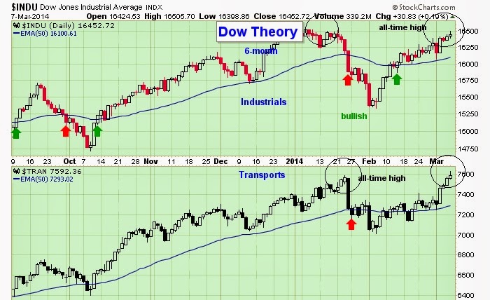
It seems with the UKRAINE drama cooling down the market shrugged its shoulders and continued its path in an upward trajectory. So far in 2014 with the sell off in January and the very violent rally there after, the market has wiped out all losses, but seems to be struggling a bit here back up at the highs.

As you can see below, the leader of the market is up at the old highs, but is losing it MOJO a bit. SO next week will be a more contributing factor to where the market is heading. And we do have an important FED meeting coming up at the end of MARCH that will set a better tone.

The transports did make new highs, but they did not stay there for long before selling off a bit. So next week will be an important one for investors to watch.


dow jones transports chart


WHAT IF YOU KNEW WHICH WAY THE MARKET WAS ABOUT TO MOVE BEFORE IT HAPPENED?  CLICK HERE To Join Our VIP ELITE GROUP  -- FREE!


Powered by 123ContactForm | Report abuse

Wednesday 5 March 2014

Is the Bull Market Over

Is the Bull Market Over

Is the Bull Market Over ? ....

With today's low interest rates, it makes sense that price-earnings ratios should be higher than average.

My friend Robert Shiller recently accepted a well-deserved Nobel Memorial Prize in Economics for his work on understanding volatility in the financial markets. Shiller has also devised an indicator for determining whether the stock market is cheap or expensive called the CAPE ratio, short for cyclically adjusted price-earnings ratio.

In calculating the market’s P/E, the standard practice is to divide the price of Standard & Poor’s 500-stock index by either the previous 12 months’ earnings for the companies in the index or analysts’ estimates of earnings over the next 12 months. But the CAPE ratio substitutes the index’s average earnings over the preceding ten years. Shiller’s rationale: Using a long-term average of past earnings reduces the likelihood that the peaks and troughs of the business cycle will lead to the use of abnormally high or low earnings in calculating the P/E.

Over time, the CAPE ratio has proved to be an accurate predictor of stock returns. Forecasts generated by the CAPE ratio have generally been very similar to those resulting from standard P/E methodology. For example, in early 2000 at the top of the tech bubble, both ratios indicated that the stock market was overvalued.

But in recent years, predictions based on each of these two ratios have diverged. The CAPE ratio recently stood more than 50% above its long-term average and presented a bearish picture of future stock returns. Traditional P/E calculations using current and forecast earnings, however, showed that the market is trading close to its average historical valuation. Which is correct?

A record fall-off. My studies indicate one reason that the CAPE ratio appears to be so bearish. Reported earnings of the S&P 500 (used by Shiller to calculate the CAPE ratio) fell a record 92% in the 12 months ended in March 2009. In fact, in the fourth quarter of 2008, S&P 500 earnings were negative for the first time in the history of the index. This sharply reduced the ten-year average and set the CAPE ratio well above its historical level. It won’t be until 2020 that the earnings depression caused by the Great Recession is no longer reflected in the ten-year average, restoring the CAPE to more-normal levels.

A more significant explanation is that over the past two decades, the method of computing the S&P 500’s reported earnings series has changed dramatically. Firms are now required to write down assets that have lost value and include those losses in reported earnings, regardless of whether the asset was sold. But firms cannot “write up” appreciated assets unless they are sold. As a result, earnings declines in the 2001 recession, and particularly in the most recent downturn, were much more severe than in any previous economic contraction.

In contrast to the S&P earnings series, corporate profits as measured by the National Income and Product Accounts did not turn negative in the fourth quarter of 2008. Furthermore, the maximum decline in 12-month earnings was 22% instead of 92%. When NIPA profits are substituted for S&P reported earnings, the CAPE ratio is only about 10% to 15% above its long-term average—not statistically meaningful.

None of this should detract from CAPE’s attractiveness. But it’s important to use a data series that has been consistently generated over the years, such as the NIPA figures. Even when the data has been collected consistently, investors should be mindful that the correct P/E for the market is not necessarily its long-term average. For instance, with today’s low interest rates, it makes sense that P/Es should be higher than average. We believe the current bull market is not over, and any correction will prove to be a buying opportunity.

Timing that buying would be crucial to ones trading, and that is why we have our VIP members section HERE. Right now, its a great time to JOIN as we are giving 60% off our normal rates. CLICK HERE TO JOIN INSTANTLY. 

Monday 3 March 2014

Vix Chart Update

Vix Chart Update

Vix Chart Update below.

The Vix chart as you can see is pretty much on a BUY signal right now. This would mean its a negative situation for the market, and VERY BULLISH for the VIX.

As we have been saying recently, its all about the VIX right now, and that call seems to be spot on the money. If you zoom back to a weekly chart on VIX, it has been perfectly trading in a range. Right now we are in the middle of that range, and it looks like the top of that range might be met again. i.e. About the 20-21 level.

Vix Chart Update
Vix Chart Update

Many traders are missing the signals, but the next few months, it would be wise to watch the VIX, we still think this is a leading indicator and that is why we bought up this chart to look at today.


WHAT IF YOU KNEW WHICH WAY THE MARKET WAS ABOUT TO MOVE BEFORE IT HAPPENED?  CLICK HERE To Join Our VIP ELITE GROUP  -- FREE!


Powered by 123ContactForm | Report abuse