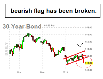
If we take a look at the us bonds daily chart it looks horrible at the moment.
Right now it looks to me that this chart has a bearish flag that has now been broken, which as you know the us bonds daily chart is the inverse to the S&P 500 so that means this is bearish for bonds, and bullish for stocks and equities at the moment.


No comments:
Post a Comment