Web Statistics The Sentiment Trader
Showing posts with label Market Breadth. Show all posts

Wednesday, 14 August 2013

nymo shows the way

The NYMO chart below is telling us the market is taking a break right now, and does not look healthy at all. Its currently at -43.


WHAT IF YOU KNEW WHICH WAY THE MARKET WAS ABOUT TO MOVE BEFORE IT HAPPENED?  CLICK HERE To Join Our VIP ELITE GROUP  -- FREE!


Powered by 123ContactForm | Report abuse

Friday, 14 June 2013

Market Breadth Chart

With all the relentless selling in the market over the last few weeks you can see that we are back down to fair value on the market breadth chart. Every time we get down under the green line and rally back above, there is a good chance the market sees some more buyers come on board. The next few days will be interesting as we are coming up for a fed meeting next week, and we see what Mr Bernanke Wanky has to say about QE tapering.

More lies, and more bullshit from the fed and government! There is one thing that we can be very thankful for, and that is charts like this below. WHY? Well simple, the charts never ever LIE! :-)


WHAT IF YOU KNEW WHICH WAY THE MARKET WAS ABOUT TO MOVE BEFORE IT HAPPENED?  CLICK HERE To Join Our VIP ELITE GROUP  -- FREE!


Powered by 123ContactForm | Report abuse

Saturday, 8 June 2013

market breadth data

market breadth data chart

The market breadth data chart (or RHNYA) below is quite an interesting chart to look at.

As you can see below, the RHNYA hit a new low a few days ago, but since then has rallied up strong to the 75.00 level.

Each time we hit a low in the market breadth and rallied, so did the market. So it is for this reason we could probably say early next week (10th - 11th June) We are probably likely to see some sort of a rally on the market. There is room to move on the upside here.

Now that the "tapering" news has died down, and traders are not so strung out about it, this chart makes sense, and could be clearing the way for some buyers to come back into the market early next week.

market breadth data
market breadth data


WHAT IF YOU KNEW WHICH WAY THE MARKET WAS ABOUT TO MOVE BEFORE IT HAPPENED?  CLICK HERE To Join Our VIP ELITE GROUP  -- FREE!


Powered by 123ContactForm | Report abuse

Tuesday, 26 February 2013

latest spx update - our latest spx update

There has been lots going on as of late, and the market did indeed need to take a break.

As you can see we topped out several days ago, and we are currently trading below the 1500 mark at or around the 1494 level.

we do have lower targets, however..........  levels, for VIP ELITE GROUP  only! - Join Here! 


spx update


The market breadth chart was in overbought territory as we have been saying a drop was due, and we are getting a nice one after reaching sentiment traders VIP levels. We are at the 65 level, and there is more room to run down, but we still remain in a bullish market. 

market breadth update


WHAT IF YOU KNEW WHICH WAY THE MARKET WAS ABOUT TO MOVE BEFORE IT HAPPENED?  CLICK HERE To Join Our VIP ELITE GROUP  -- FREE 10 Day Trial Offer Today! 

Saturday, 16 February 2013

Market Breadth - Market breadth charts

The Advance-decline chart or the stocks above or below their Moving averages is telling us the market is getting super excited.

Yes it will need to cool down soon, but we expect things to ..... (VIP MEMBERS ONLY)

market breadth
market breadth chart


WHAT IF YOU KNEW WHICH WAY THE MARKET WAS ABOUT TO MOVE BEFORE IT HAPPENED?  CLICK HERE To Join Our VIP ELITE GROUP  -- FREE 10 Day Trial Offer Today! 


Thursday, 14 February 2013

McClellan Timer chart - McClellan Timer chart

McClellan Timer chart below.

As you can see the McClellan timer chart is a good chart to spot divergences. The chart below is showing us that the Nasdaq has been in a nice upwards channel since the very beginning of 2013. We have not busted out of this channel on the up side or the down side.

The most important thing on this chart is that the NAMO market breadth has been declining for the last few months, while the price has been increasing slowly and steadily.

The NAMO is still in positive territory and that is a good thing for the bulls, and due to the face we are still in that upwards channel drawn below, that is also favoring the bulls.

The worrying thing here is that rising price, and falling NAMO is not bullish typically.

This chart is now telling us that the 3150 or around this level is very significant.

McClellan Timer chart
McClellan Timer chart 


WHAT IF YOU KNEW WHICH WAY THE MARKET WAS ABOUT TO MOVE BEFORE IT HAPPENED?  CLICK HERE To Join Our VIP ELITE GROUP  -- FREE 10 Day Trial Offer Today! 

Tuesday, 29 January 2013

Dow Jones Transports Chart - Strong Dow Jones Transports Chart

Have a look at the dow jones transports chart below.

What we have noticed is that our breadth indicator charts have been spot on, as on the chart below, the dow jones trasports chart is showing us that we have hardly even seen one red day on the market this year. WOW!

Over $44 billion dollars has been put into work on the market since the 1st of January, and as  you can see they want to put this money to work, or make it work for them (as they say)

We said at the start of the year, DO NOT FALL IN LOVE WITH THE DOWNSIDE, and now you can see why!.

The DOW JONES TRANSPORTS CHART does look strong, and yes, a top will come soon, however we just look and read charts first, and the dow jones transports chart below is still looking very bullish.
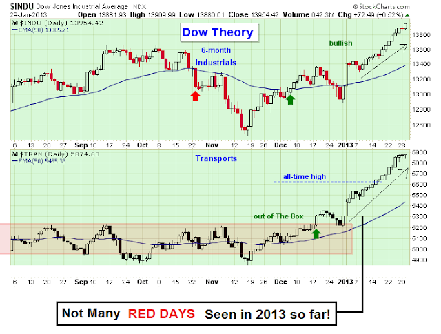
dow jones transports chart


The vix chart below is showing us that it has been very suppressed lately and has struggled to find a bid. As you know the VIX is the inverse trade to the S&P and stock market, it has given the bulls just what they need to keep the market bullish and to keep that $44 billion dollars (we mentioned above) hard at work!!!!!!

Over the last few weeks, the VIX has tested the 14 level, and failed to get above, which has been helping the bulls. 


vix daily chart
vix daily chart


WHAT IF YOU KNEW WHICH WAY THE MARKET WAS ABOUT TO MOVE BEFORE IT HAPPENED?  CLICK HERE To Join Our VIP ELITE GROUP  -- FREE 10 Day Trial Offer Today! 

Wednesday, 2 January 2013

What the charts say

If we take a look at summation, we have not hit a sell signal in the market yet. As we have been saying, there is not reason to FALL IN LOVE WITH THE DOWNSIDE at the moment, no matter what others are saying or telling you to do.

When the charts tell you to buy dips, that is the smartest thing you should do. If you have been doing this and following your charts, you should be doing very well.  That is still what the summation is screaming at us for now. When we get to debt ceiling and fourth quarter reports, in a few weeks, that could be a different story but for now, that summation is still on a buy, and hinting to remain a bit cautious.


If you remember back a few weeks ago, we hinted that 1500 could be coming on the market. YOU CAN READ THE POST HERE . I called it a wild prediction, however with the fiscal cliff drama out of the way, it DOES NOT seem so much of a wild prediction any more.  Some readers did laugh off such claims, but see how 2 days can make a difference on the market.

Infact if we take a look at the weekly S&P chart, you can see how 1500 is not very far away at all now. The band-aid fix to the fiscal cliff did help alot and we would not be surprised to see 1500 come. I guess time will tell.


spx weekly chart
spx weekly chart


WHAT IF YOU KNEW WHICH WAY THE MARKET WAS ABOUT TO MOVE BEFORE IT HAPPENED?  CLICK HERE To Join Our VIP ELITE GROUP  -- FREE 10 Day Trial Offer Today! 

Saturday, 15 December 2012

Weekend Update


Taking a quick look at the market on the weekend, the weekly USD chart is not looking very strong at all. And that will soon give some buoyancy to the S&P 500 down the track. The proof is in the pudding and this chart is looking sickly at best.

Taking a closer look, the Weekly USD chart has almost formed a bearish head and shoulders pattern, and if it passes through the 78 level, there is likely more trouble to come for USD, and will bring back strong buying to the stock and global markets. So watch that level closely.


The RHNYA or NYSE breadth indicator has as MACD crossover, and it is signaling the bears might have a bit of fun on the downside. But still The breadth remains strong, and proves that there is still smart money buying around the traps. It is just not as strong as it was a in the middle of NOVEMBER.


We still believe 1500 could be coming on the S&P 500, as we have predicted in this
POST HERE  and as said there are no guarantees with the market or with our analysis, but our VIP members have had a great year, and we have had many market predictions play out perfectly. Hopefully this will be another to add to our tally. :-)


WHAT IF YOU KNEW WHICH WAY THE MARKET WAS ABOUT TO MOVE BEFORE IT HAPPENED?  CLICK HERE To Join Our VIP ELITE GROUP  -- FREE 10 Day Trial Offer Today! 

Thursday, 15 November 2012

Market Breadth - What is market breadth saying?

The bears have done a lot of damage to the market in the last several weeks, everyone was out there screaming buy buy buy, but we warned of more downwards coming on the market. That is exactly what happened. Yesterday from opening bell there was sell stop program going off one after the other all the way to the closing bell.

Right now the Nasdaq chart (the leader) is down at its 50% retracement level from the last MAJOR UP move which started late 2011.

The nasdaq market breadth chart below, shows we are getting close to the market being in oversold / buy zone territory. It is signaling this down move is now getting long in the tooth! There is a chance we can sell off a bit lower, but it doesn't matter, the breadth is telling us that we should see the start of another rally soon.

VIP MEMBERS <== have the exact levels and targets to look for!.

WHAT IF YOU KNEW WHICH WAY THE MARKET WAS ABOUT TO MOVE BEFORE IT HAPPENED?  CLICK HERE To Join Our VIP ELITE GROUP  -- 30 Day Trial Offer Today!