Web Statistics June 2013

Friday, 28 June 2013

Market Update 29th June 2013

The Fed Tapering News Is Really causing some havoc with the market. I Explain why in the VIDEO below.

WATCH the Latest Market Update Video Below.

Market Update - Video Analysis 29th June
 

=======================================================
BLOCKED CONTENT HERE  -  PREMIUM VIP MEMBERS ONLY! 
(VIP Subscription Details Below)
=======================================================
=======================================================================

How Can I Join Sentiment Trader's Premium ELITE VIP Membership with FULL ACCESS?


Sentiment Trader's premium ELITE VIP Membership with Chip is a Sunday through Thursday evening extended membership, which include charts, news, data & video also. Chip disects the Futures, and Stock market. If you're a new member you can join the premium ELITE membership for a 30 Day test drive BELOW for  -  ONLY  $1.99

Offer Is Valid for New Members Only


Proof Is in The Pudding

Proof Is in The Pudding 

Why do I say that?

Well its pretty simple really!

The S&P 500 Is in Trouble here we feel. A few days ago, we warned that the rally we saw was just the FED trying to spin some positive bullshit all around, like a little arrogant fairy god mother, waving her magical wand trying to brainwash people. Well, yes it did work, but the proof is really in the pudding. Jokes and news aside you can see the S&P chart below has been in a sold uptrend since January 2013, we broke this uptrend a few days ago, and now this rising support line has now become resistance. WOW!

These lower highs on the market are not a good thing. This is clear evidence to us that the SMART MONEY is still selling, and we are most likely to see lower prices in the short term.


spx daily chart
spx daily chart


WHAT IF YOU KNEW WHICH WAY THE MARKET WAS ABOUT TO MOVE BEFORE IT HAPPENED?  CLICK HERE To Join Our VIP ELITE GROUP  -- FREE!


Powered by 123ContactForm | Report abuse

Thursday, 27 June 2013

3 day Rally On The Market

3 day Rally On The Market? What does it mean?

Stocks closed near their highs Thursday, rallying for a third-straight session, lifted by a string of upbeat economic reports and following several speeches from Federal Reserve policymakers suggesting the central bank has alot of time before it starts reducing its bond-buying programs.

With this news, the pressure has been taken off the market and the participants are now out of a panic phase. But is this really a time to calm down and think everything is ok?

Well lets take 3 things into consideration.

Looking at the S&P daily chart below you can see....

1) We are in a longer term downwards channel with lower highs and lower lows.

2) We bounced nicely off the 1560 area or - oversold valuations from the fed announcement.

3) We are now in an "area of significant resistance", and the market is about to decide where to go from here.

With that said, it is obvious the market is still not out of trouble. Not until we see higher lows and higher highs is the market able to get back on its feet, and that has not being playing out. So it is wise to be cautious here.

spx daily chart
SPX daily chart


WHAT IF YOU KNEW WHICH WAY THE MARKET WAS ABOUT TO MOVE BEFORE IT HAPPENED?  CLICK HERE To Join Our VIP ELITE GROUP  -- FREE!


Powered by 123ContactForm | Report abuse

Wednesday, 26 June 2013

put call data

As you can see below, the put call data is telling us 2 things.

1)  There are lots of people thinking this is a bottom on the market, as people have been buying calls - or betting the market will go considerable higher from here. 

2) The bulls have not got enough power to give us a  nice bounce on the market. 

It seems the bulls have lost their mojo here, and we are thinking the market is still feeling pressure here.

put call data
put call data


WHAT IF YOU KNEW WHICH WAY THE MARKET WAS ABOUT TO MOVE BEFORE IT HAPPENED?  CLICK HERE To Join Our VIP ELITE GROUP  -- FREE!


Powered by 123ContactForm | Report abuse

Tuesday, 25 June 2013

5 Reasons Why Gold Will Plunge Further

5 Reasons Why Gold Will Plunge Further

We have already showed the gold chart here on the blog. Here is an update version.

5 Reasons Why Gold Will Plunge Further

This chart above does not look particularly well for gold. Infact the targets off the top of the triangle lead all the way down to 1150 or so level, so the trouble is not over for gold yet technically no doubt.

But....

Here are the 5 Reasons Why Gold Will Plunge Further

In its second downgrade since April, HSBC is now predicting that the average gold price will be $1,396 in 2013, down from $1,542. While UBS last week changed its 12-month forecast by more than 40 percent to $1,050.

The reasons for this downgrade are five-fold says HSBC. From the U.S. Federal Reserve tapering its bond buying program leading to a stronger dollar to falling demand from India and China as growth slows in these emerging economies, all factors are going to take the precious metal lower in coming months.

"After an initially encouraging upwards price performance in the aftermath of the April sell-off, which lasted until early May, the bullion rally lost momentum and gold and silver prices resumed their slide, with losses accelerating notably in the aftermath of the June 18-19 FOMC [Federal Open Market Committee] meeting," HSBC said in a note, referring to the Fed meeting when chief Ben Bernanke signaled that it could soon scale back its $85 billion a month bond buying program.

Gold prices have plunged over 20 percent since April to around $1,276 on Tuesday.

India and China Weigh

Besides the Fed factor, the growing pessimism over China's growth prospects will also weigh on gold prices as the world's second largest economy is also the second largest consumer of gold.

"Our economists cut 2013 China GDP [gross domestic product] forecast from 8.2 percent to 7.4 percent and 2014 GDP forecast from 8.4 percent to 7.4 percent," HSBC said.

Plus India, the largest consumer of the precious metal has also taken steps to curb appetite for gold.

"Increased import duties and the Indian government's efforts to reduce gold imports are curbing that nations' demand for bullion and crimp jewelry demand," HSBC said.

On Monday, India's largest jewelers' association - the All India Gems and Jewelry Trade Federation - that represents about 90 percent of jewelers asked members to stop selling gold bars and coins, adding to the government's efforts to cut gold imports and stem a growing current account deficit, Reuters reported.

Besides lackluster demand for physical gold, HSBC says a stronger U.S. dollar as the Fed withdraws liquidity will lead to more weakness in gold. The dollar index, which measures its value against a basket of foreign currencies, is up over 4 percent from a yearly low in February.

Finally, another support for gold - central bank buying is now either falling or not growing as quickly, HSBC said.

"These [gold] reserves are now either falling or not growing as quickly due to declines in current account balances in many emerging market nations as a consequence of the slowdown," the bank wrote.
Here are the 5 Reasons Why Gold Will Plunge Further

WHAT IF YOU KNEW WHICH WAY THE MARKET WAS ABOUT TO MOVE BEFORE IT HAPPENED?  CLICK HERE To Join Our VIP ELITE GROUP  -- FREE!


Powered by 123ContactForm | Report abuse

The Dow Jones Trannies Breadth Chart

We are in T+3 today, and the terminal read shows that the smart money marks up their winners, and dumps their losers today.  
 
big imbalances on the sell side.

Looking at the market breadth of the dow jones transports or the leader of the market you can see the smart money is heading for the exits or has been selling recently. So for those of you who are thinking the market is out of trouble right now, this chart is telling us that that is not the right way to think at the moment.

The market does face some head winds at the moment, and there is alot of data coming out of china, or china focused this week. That could keep the market nervous, as China is in fear of a potential credit crunch at the moment. But we forget the news right now and just study our charts, as they are very telling at the moment, and this one is a good one to go by.


djta chart
djta chart


WHAT IF YOU KNEW WHICH WAY THE MARKET WAS ABOUT TO MOVE BEFORE IT HAPPENED?  CLICK HERE To Join Our VIP ELITE GROUP  -- FREE!


Powered by 123ContactForm | Report abuse

Saturday, 22 June 2013

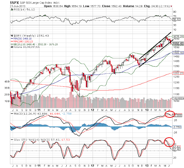
spx weekly chart - what does it tell us

This is another favourite chart to watch amongst our  VIP MEMBERS HERE

As you have noticed we have been watching the weekly SPX chart very carefully! You have to love this chart if you are a trader, small or large as it really shows the power and how much the government has kept the markets afloat with their bullshit printing off of money.

"Hey you, check out this money we just printed, lets chuck it in the market!"

That is an awesome idea.....NOT! :-P

I can sit here all day and tell you how stupid the government is, and how much they love to work against you in your day to day life.....can you say *cough* Edward Snowden *cough*  haha. LOL.

Yes I can ream on all day about the government, but realistically I wont waist my time because it will not help you make money on the market.

Back to the charts : So in laymens terms the weekly chart has  now busted out of a nice rising channel it has been in since DECEMBER 2012. The stochastics and macd are also on a sell signal right now, so we have a big warning sign the market is about to hit the skids some more and a more down could be on the way in the next several weeks.

Even if we do see more profit taking and selling off, I would not go falling in love with the downside.

Yes the market does have some downside work to do, infact there could be some more violent selling off, but again, there are too many people screaming for a crash to 666 on the S&P. Now I am not saying that wont happen, but that is a low probability is all. I have posted many charts here in the blog that confirm we are still in a bull market. And we have to remember that bull markets do not go up in a straight line, that is for sure.

Looks like with the action we have seen in the last two weeks, we are going to have a very volatile summer on our hands. For some this will be great, and I love trading in this environment, but for others, they will get chopped up and lose their accounts. So you have been warned.


spx weekly chart
spx weekly chart


WHAT IF YOU KNEW WHICH WAY THE MARKET WAS ABOUT TO MOVE BEFORE IT HAPPENED?  CLICK HERE To Join Our VIP ELITE GROUP  -- FREE!


Powered by 123ContactForm | Report abuse

Dow Jones Transports Daily Chart

We told our VIP MEMBERS HERE to watch this leader, and it has paid off well.

As you can see on the trannies chart below (or the leader of the market) we have not spent 2 days below the EMA 50 line. In the past this has not been a good sign for the market, or is a big warning sign we would like to think.

The fed announcement this week has really played havoc with the market, but we love these volatile trading conditions as it has presented some very good trading opportunities.

dow jones transports chart


WHAT IF YOU KNEW WHICH WAY THE MARKET WAS ABOUT TO MOVE BEFORE IT HAPPENED?  CLICK HERE To Join Our VIP ELITE GROUP  -- FREE!


Powered by 123ContactForm | Report abuse

The Tick Reading - Half Way Point

Our VIP MEMBERS HERE love the tick reading chart, and as you can see the doji day thrown on friday leads us to believe the buyers do have a bit more energy. We were oversold on 5 min tick chart for friday and we got a little rally into the close.

This could mean we are going to see a little upwards momentum on MON - TUES next week, as there is good upside potential in the tick data.

5 min tick chart
tick data


WHAT IF YOU KNEW WHICH WAY THE MARKET WAS ABOUT TO MOVE BEFORE IT HAPPENED?  CLICK HERE To Join Our VIP ELITE GROUP  -- FREE!


Powered by 123ContactForm | Report abuse

Thursday, 20 June 2013

S and P In trouble.

We hinted a few days ago that the S&P could be forming a bearish flag. These patterns have about a 80% chance of playing out in technical analysis terms. This did in fact play out, and the market is now in serious trouble.

The bottom of the bearish flag broke today, and skidded down to the 1580 level. We have bounced a bit, however as you can see on the chart, things do not look too good for the S&P right now.

If the bears come out in droves, we could see 1550 come soon, and maybe even lower, but the target off that flag is about the 1550 - 1560 level. Time will tell.


S&P broke bearish flag


WHAT IF YOU KNEW WHICH WAY THE MARKET WAS ABOUT TO MOVE BEFORE IT HAPPENED?  CLICK HERE To Join Our VIP ELITE GROUP  -- FREE!


Powered by 123ContactForm | Report abuse

Gold In Trouble

Since the fed announcement we can see that the market has been heavily influenced. Gold has not been doing very well lately, and with the fed news, things just got worse for gold.

When you take a look at the chart you can see that we have now breached the 1300 level, which is a good psychological level, and gold has also broken what we term a descending triangle too with the support being just above the 1300 level.

That would mean a double confirmation that we will soon see lower prices in gold.


gold in descending triangle pattern

WHAT IF YOU KNEW WHICH WAY THE MARKET WAS ABOUT TO MOVE BEFORE IT HAPPENED?  CLICK HERE To Join Our VIP ELITE GROUP  -- FREE!


Powered by 123ContactForm | Report abuse

Wednesday, 19 June 2013

spx bearish flag showing after FOMC

spx bearish flag showing after FOMC

Our VIP ELITE GROUP HERE!  Got plenty of warning about what was coming today.  The TRIN reading was pretty much giving it away.

Todays FOMC meeting was a chance for the bears to really come back and grit their teeth so to speak. The Market sold off hard down to the low 1620's and right now if you look at the chart there seems to have been a bearish flag that has formed.

If we break the 1615 level on the S&P that could spell real trouble and the market is not looking very healthy here.


spx bearish flag
spx chart - bearish flag playing out ?

Since the middle of May, if you remember back Dummy boy Bernanke and his cartmen stubled and stammered on congress hill and hinted about the end of QE and stimulus into the market. Today was just reiterating that.

News is nothing more than boring for me, and this came out in the charts first. This pattern now, or I would think it is a high probability bearish flag (meaning there is a strong chance of more movements to the downside) could play out now, as retail traders try to decipher the news, while we just trade the charts. :-) ** insert cheesy grin here **


WHAT IF YOU KNEW WHICH WAY THE MARKET WAS ABOUT TO MOVE BEFORE IT HAPPENED?  CLICK HERE To Join Our VIP ELITE GROUP  -- FREE!


Powered by 123ContactForm | Report abuse

Tuesday, 18 June 2013

Tomorrow's FOMC Trading Strategy

Tomorrow's FOMC Trading Strategy


This week is a little tricky to trade at the moment, especially tomorrow with the FED meeting, and alot of my members have been asking what is the best way to trade the FOMC without risking alot of captial.

It is quite simple really, and this is the way I have done it for years!

I think it is more astute to go get out of the way of the announcement and just wait about 30 mins and see what happens. Sometimes there is some surprise moves to the upside and downside before the actual announcement so it is best to stay away right up until 30 mins after the announcement, then you can hunt and see if there are some nice opportunities that present themselves especially to the long side if the market continues along it positive trajectory.

spx range


WHAT IF YOU KNEW WHICH WAY THE MARKET WAS ABOUT TO MOVE BEFORE IT HAPPENED?  CLICK HERE To Join Our VIP ELITE GROUP  -- FREE!


Powered by 123ContactForm | Report abuse

Saturday, 15 June 2013

Market Update 16th june 2013

A little bag of goodies to help you trade in this crazy market! 

WATCH the latest Market Update Video Below.

Market Update - Video Analysis 16th June


=======================================================
BLOCKED CONTENT HERE  -  PREMIUM VIP MEMBERS ONLY! 
(VIP Subscription Details Below)
=======================================================
=======================================================================

How Can I Join Sentiment Trader's Premium ELITE VIP Membership with FULL ACCESS?


Sentiment Trader's premium ELITE VIP Membership with Chip is a Sunday through Thursday evening extended membership, which include charts, news, data & video also. Chip disects the Futures, and Stock market. If you're a new member you can join the premium ELITE membership for a 30 Day test drive BELOW for  -  ONLY  $1.99

Offer Is Valid for New Members Only


Friday, 14 June 2013

Dow Jones Transports Chart - Steady As She Goes Captain

The Leader of the market or the (DOW JONES TRANSPORTS) chart is showing that since March of this year 2013 it has been in a larger upwards channel. Interestingly enough we have been bouncing off that line over the last few days however we did not breach that line, and that is telling us that the market still has some sort of strength even though there has been rumors of the fed talking about culling of the quantitative easing and liquidity pumping up of the markets.

It is obvious to me that there are head winds for the markets over the next few weeks, but that does not mean a thing as technically we have not breached the risisng support line, so until that happens there is no need to panic.


WHAT IF YOU KNEW WHICH WAY THE MARKET WAS ABOUT TO MOVE BEFORE IT HAPPENED?  CLICK HERE To Join Our VIP ELITE GROUP  -- FREE!


Powered by 123ContactForm | Report abuse

Market Breadth Chart

With all the relentless selling in the market over the last few weeks you can see that we are back down to fair value on the market breadth chart. Every time we get down under the green line and rally back above, there is a good chance the market sees some more buyers come on board. The next few days will be interesting as we are coming up for a fed meeting next week, and we see what Mr Bernanke Wanky has to say about QE tapering.

More lies, and more bullshit from the fed and government! There is one thing that we can be very thankful for, and that is charts like this below. WHY? Well simple, the charts never ever LIE! :-)


WHAT IF YOU KNEW WHICH WAY THE MARKET WAS ABOUT TO MOVE BEFORE IT HAPPENED?  CLICK HERE To Join Our VIP ELITE GROUP  -- FREE!


Powered by 123ContactForm | Report abuse

Daily Crude Chart

The CRUDE chart right now is really taking my fancy!, There is alot of term oil over in the middle east and that normally plays havoc on the economy over there, but as a trader I love it, and I rub my hands together, as there is normally nice fluctuations on the market to profit from.

Right now is no different, and my analogy about the middle east problems is playing out again in the charts.

Take a look at crude at the moment, you can see that since the start of 2013 there has been an inverted head and shoulders pattern that has developed. We have broken the neckline only in the last few days, and there is a fair chance we are going to see higher prices in crude in the coming weeks. Especially if tensions over in the middle east escalate. This is an awesome chart to keep an eye on.


WHAT IF YOU KNEW WHICH WAY THE MARKET WAS ABOUT TO MOVE BEFORE IT HAPPENED?  CLICK HERE To Join Our VIP ELITE GROUP  -- FREE!


Powered by 123ContactForm | Report abuse

Wednesday, 12 June 2013

dow jones transports daily chart - very telling.

The chart below is quite telling  - Which we have been talking about in the VIP ROOM HERE!

The top chart is the DOW JONES index, and bottom chart is the leader of the indicies the DOW JONES transportation average. As you can see, the leader has now crossed the 50 EMA moving average line. That is not a good thing, and sellers have come back into this market the last few weeks, and this is very clear. 

The alarm bells are ringing, however if you look at the top chart we have had a very massive bull run for the last several months, so the negative action over the last few days does not surprise us. 

Normally each year on the market, no matter if you are in a bull market or bear market you will normally always get one large corrective sell off. We could be seeing that now, and time will tell. 

dow jones transports chart


WHAT IF YOU KNEW WHICH WAY THE MARKET WAS ABOUT TO MOVE BEFORE IT HAPPENED?  CLICK HERE To Join Our VIP ELITE GROUP  -- FREE!


Powered by 123ContactForm | Report abuse

The Put Call Ratio

The chart below is the up to date put call data  - Which we have been talking about in the VIP ROOM HERE!

As you can see the smart money has been shorting or selling the market for a few weeks now. Is this the start of a crash, well I doubt that, because we have been in an unrelenting buying environment, its just time to take a rest.

put call data
put call data


WHAT IF YOU KNEW WHICH WAY THE MARKET WAS ABOUT TO MOVE BEFORE IT HAPPENED?  CLICK HERE To Join Our VIP ELITE GROUP  -- FREE!


Powered by 123ContactForm | Report abuse

Monday, 10 June 2013

Nikkei Stumbles Badly

Nikkei Stumbles Badly


nikkei stumbles
nikkei stumbles

Japan's benchmark Nikkei resumed trade in the afternoon session to shed as much as 1.5 percent as investors digested the Bank of Japan's decision to revise up its assessment of the economy and leave monetary policy unchanged.

Analysts widely expected no action from Japan's central bank but many were hoping for additional steps to ease recent market turbulence. The disappointment was reflected in the yen, which strengthened to the 98 handle per dollar from its previous level of 98.9.

The central bank cited an economic pick-up, rising overseas and domestic demand as reasons for staying pat. Governor Haruhiko Kuroda will hold a media briefing later on Tuesday to explain the central bank's decision.


WHAT IF YOU KNEW WHICH WAY THE MARKET WAS ABOUT TO MOVE BEFORE IT HAPPENED?  CLICK HERE To Join Our VIP ELITE GROUP  -- FREE!


Powered by 123ContactForm | Report abuse

Saturday, 8 June 2013

market breadth data

market breadth data chart

The market breadth data chart (or RHNYA) below is quite an interesting chart to look at.

As you can see below, the RHNYA hit a new low a few days ago, but since then has rallied up strong to the 75.00 level.

Each time we hit a low in the market breadth and rallied, so did the market. So it is for this reason we could probably say early next week (10th - 11th June) We are probably likely to see some sort of a rally on the market. There is room to move on the upside here.

Now that the "tapering" news has died down, and traders are not so strung out about it, this chart makes sense, and could be clearing the way for some buyers to come back into the market early next week.

market breadth data
market breadth data


WHAT IF YOU KNEW WHICH WAY THE MARKET WAS ABOUT TO MOVE BEFORE IT HAPPENED?  CLICK HERE To Join Our VIP ELITE GROUP  -- FREE!


Powered by 123ContactForm | Report abuse

Friday, 7 June 2013

inverted head and shoulders pattern - CRUDE CHART

inverted head and shoulders pattern - CRUDE CHART

The crude chart is very interesting at the moment. There seems to be a larger inverted head and shoulders pattern that has formed on the chart. If we break the 97 region, it could be off to the races so to speak. This chart is being watched by alot of the analysts out there, and with the tension and riots over in the middle east right now, buyers seem to be snapping up crude at this prices.

inverted head and shoulders pattern
crude chart

WHAT IF YOU KNEW WHICH WAY THE MARKET WAS ABOUT TO MOVE BEFORE IT HAPPENED?  CLICK HERE To Join Our VIP ELITE GROUP  -- FREE!


Powered by 123ContactForm | Report abuse