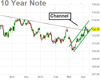
The 10 year bond chart below has been performing very strong lately even with the market hitting new highs! This is highly unusual? Normally you do not see this sort of action. Normally the 10 year bond chart is the inverse trade (or does the opposite) to the S&P. Lately the S&P 500 and the 10 year bond chart have been trading in tandem, so there is something fishy going on.
The S&P hit all time highs in the last few days, and looking at the 10 year bond chart below it is looking extremely strong at the moment.
There are also some other obvious things to note about the chart below.
1) The 10 year bond chart has broken out of a longer term falling resistance line.
2) The 10 year bond chart has been in a nice steep upwards channel since the start of March 2013 which seems to be holding quite well.
 |
| 10 year bond chart |
WHAT IF YOU KNEW WHICH WAY THE MARKET WAS ABOUT TO MOVE BEFORE IT HAPPENED? CLICK HERE To Join Our VIP ELITE GROUP -- FREE 10 Day Trial Offer Today!

No comments:
Post a Comment