Web Statistics The Sentiment Trader
Showing posts with label djia chart. Show all posts

Wednesday, 22 July 2015

dow transports chart - dow transports chart warning us

dow transports chart - dow transports chart warning us

So This morning I took a quick peek at dow transports chart along with the dow jones charts

Now I know that the Dow jones transports chart is now not as fully weighted as it once was, but I have learnt that you should chart this every day, as its the leader of the market. So its a good habit to get into.

Anywho.....

When you look at the dow jones chart, and also the dow jones transports chart you can see that the DOW JONES just popped below the 50 day moving average line today, and the transports, is looking sickly. It cannot even get its head above level. Maybe this is a warning that some more selling might be about to come into the market. Sure looks that way anyway? time will tell.

I am not saying we will crash soon, no way! But what I am saying is that when these patterns stick out like a sore thumb one must pay attention.

I cover more and more technical analysis ==> HERE in our VIP members section.


dow transports chart

oon, n WHAT IF YOU KNEW WHICH WAY THE MARKET WAS ABOUT TO MOVE BEFORE IT HAPPENED?  CLICK HERE To Join Our VIP ELITE GROUP  -- FREE!


Powered by 123ContactForm | Report abuse

Friday, 7 March 2014

Market Update - The Wrap

Market Update - The Wrap

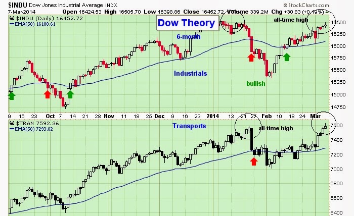
It seems with the UKRAINE drama cooling down the market shrugged its shoulders and continued its path in an upward trajectory. So far in 2014 with the sell off in January and the very violent rally there after, the market has wiped out all losses, but seems to be struggling a bit here back up at the highs.

As you can see below, the leader of the market is up at the old highs, but is losing it MOJO a bit. SO next week will be a more contributing factor to where the market is heading. And we do have an important FED meeting coming up at the end of MARCH that will set a better tone.

The transports did make new highs, but they did not stay there for long before selling off a bit. So next week will be an important one for investors to watch.


dow jones transports chart


WHAT IF YOU KNEW WHICH WAY THE MARKET WAS ABOUT TO MOVE BEFORE IT HAPPENED?  CLICK HERE To Join Our VIP ELITE GROUP  -- FREE!


Powered by 123ContactForm | Report abuse
Monday, 7 October 2013

DJIA chart

Taking a look at the dow jones daily chart you can see the sell off has continued.

We are seeing more profit taking by the big guns also, as we explained here 

We are nearing significant support as the debt crisis and the Gobbermint shutdown continue.


WHAT IF YOU KNEW WHICH WAY THE MARKET WAS ABOUT TO MOVE BEFORE IT HAPPENED?  CLICK HERE To Join Our VIP ELITE GROUP  -- FREE!


Powered by 123ContactForm | Report abuse

Saturday, 28 September 2013

Debt Ceiling Crisis - The devil debt ceiling Crisis

Debt Ceiling Crisis - The devil debt ceiling Crisis

You have to hand it to the US government. They are certainly innovators when it comes to the US economy. LOL. Just as you think they have run out of crisis' up pops the debt ceiling again whcih could see the Obama administration run out of money again by OCT 17th next month.

To be precise no president in the history of the US has been in this position where they can no longer borrow, and he is in uncharted territory here.

Investors are certainly feeling the pinch recently, as the DOW JONES hit a nice resistance point and has sold off all this week.


  WHAT IF YOU KNEW WHICH WAY THE MARKET WAS ABOUT TO MOVE BEFORE IT HAPPENED?  CLICK HERE To Join Our VIP ELITE GROUP  -- FREE!


Powered by 123ContactForm | Report abuse

Monday, 23 September 2013

Dow Jones Daily Chart

Dow Jones Daily Chart


dow jones daily chart


The Dow Jones Daily Chart is showing that we have had 3 down days in a row. Something that has not happened for a while. You can see that we are getting close to a 50 Moving Average too, which is watched by alot of analysts. The MACD signal is still not on a SELL signal.

Still I think we are holding pretty well after the major run we have had up over the last few weeks, and sentiment trader things we are still in a bull market. The debt ceiling talks are really messing with the markets here, and more lies from capitol hill will not give the market too much direction in the short term. Tapering and also debt ceiling is the talk of the town right now going into the end of the year!

  WHAT IF YOU KNEW WHICH WAY THE MARKET WAS ABOUT TO MOVE BEFORE IT HAPPENED?  CLICK HERE To Join Our VIP ELITE GROUP  -- FREE!


Powered by 123ContactForm | Report abuse

Thursday, 8 August 2013

Head and shoulders pattern

Head and shoulders pattern on dow ?

Stocks snapped a three-day losing streak Thursday, with the S&P 500 finishing just below the 1,700 mark, buoyed by stronger-than-expected Chinese trade data and following a favorable jobless claims report.

Right now there are alot of analysts saying this market is strong... however if we look at the DOW JONES chart, I would not be calling this chart strong at all.

First of all we have been travelling sideways for weeks now.

Second, we are in summer trading and volume is very light making the action quite volative.

Lastly, as a whole the last few weeks could be nothing more than a nice HEAD AND SHOULDERS pattern, which would be a warning for people NOT to be too bullish for now.


dow jones daily chart


WHAT IF YOU KNEW WHICH WAY THE MARKET WAS ABOUT TO MOVE BEFORE IT HAPPENED?  CLICK HERE To Join Our VIP ELITE GROUP  -- FREE!


Powered by 123ContactForm | Report abuse

Thursday, 4 July 2013

The Dow Weekly Chart

The Dow Weekly Chart

It is always good from time to time to step back and take a look at the weekly charts.

Taking a look at The Dow Weekly Chart below and keeping analysis very simple, we can see 3 interesting things.

1) We are in a solidified uptrend longer term. There is no doubt about it. When you see a chart go from the [ bottom left to the top right ] it means you are in a "BULLISH MARKET" not a bearish market as some bears out there are yelling and screaming right now.

2) The Dips on the market in the last few years only seem to last several weeks, and then we simply resume back to the upside and see higher prices. 

3) The dow has been in a massive upwards channel and it has broken out to the upside, the resistance on the top of this channel now seems to be holding as SUPPORT. 

dow weekly chart
dow weekly chart

Make no mistake about it, the market is still doing well. The bulls have been winning overall on this weekly chart, and is suggesting that longer term we are more likely to see higher prices come on the market.


WHAT IF YOU KNEW WHICH WAY THE MARKET WAS ABOUT TO MOVE BEFORE IT HAPPENED?  CLICK HERE To Join Our VIP ELITE GROUP  -- FREE!


Powered by 123ContactForm | Report abuse

Sunday, 24 March 2013

The Air Up There

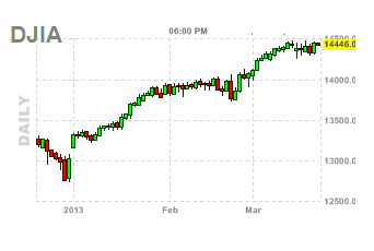
After new highs each week on the market, you can see the dow jones, has hit some headwinds, and has not really done much at all in the last few weeks.

The levy news in cypress did not help one bit, and it is obvious from the chart below, traders right now are in a 'wait and see' approach.


Free Newsletter (Worth $97)


.